
CLIENT:
MEE Lab
INDUSTRY:
UX/UI Design
ROLE:
UX/UI, Motion, Research
TEAM:
Team of 4
YEAR:
2024

the shift.
problem.
Individuals with autism often lack a natural sensory filter, making daily activities consume unpredictable amounts of energy. This constant sensory processing makes it difficult to structure routines and recognize early signs of overstimulation. Without a clear way to gauge mental limits, unexpected events quickly lead to severe exhaustion and meltdowns.
outcome.
MijnBalans is a specialized Autism Energy Tool designed to visualize and manage cognitive load. By weighing the impact of activities and prompting timely rest moments, it helps users maintain a healthy energy balance. Through daily reflection on past estimates, users learn to build sustainable routines and proactively prevent overstimulation.
We shifted the design focus from reactive recovery to proactive energy management. Since users often only recognize their limits after they have already crossed them, this approach transforms abstract mental exhaustion into a tangible, visual balance, empowering them to navigate their days with autonomy and foresight.
the solution.
Balancing Cognitive Load
Interactive Tour: Finding Daily Balance
MijnBalans is a digital companion that translates abstract mental energy into a concrete, visual scale. By assigning visual weights to daily activities and prompting timely rest moments, the app actively prevents sensory overload. Users are empowered to proactively manage their cognitive budget, build sustainable routines, and safely navigate their day without crossing their limits.
research.
Stepping into the User's World


To design a genuinely human-centered application, acknowledging your own knowledge gaps is the first crucial step. I immersed myself in the subject by attending expert seminars and, more importantly, listening to firsthand accounts from experiential experts (individuals living with autism). While professionals provided the clinical framework, hearing directly from the target audience yielded the most invaluable, raw insights that drove our design strategy.
When designing for neurodiversity, 'Less is More' is a necessity, not just a preference. Replacing complex rating scales with simple, intuitive indicators drastically reduces cognitive friction.

UX Expert Panel Feedback
From Affinity Mapping to Concept Generation


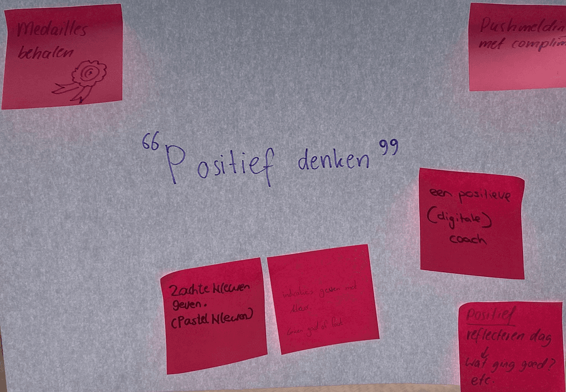


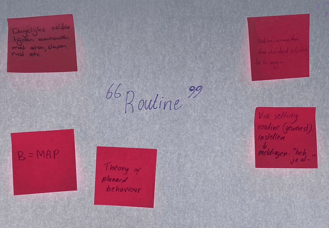
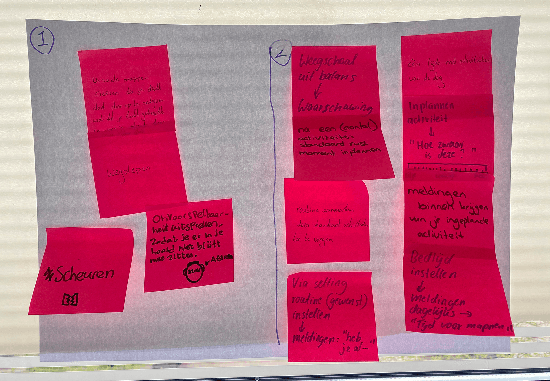
Raw research data is only valuable when structured correctly. We used affinity mapping to cluster our findings on autism spectrum criteria and cognitive overload into manageable themes. Moving from broad research to targeted ideation, we applied an 'Exclusive Design' strategy based on real-world user challenges, such as recognizing overstimulation and maintaining routines. By addressing these highly specific needs, we successfully generated two distinct concepts that directly responded to the user's daily struggles.
People often only recognize their mental boundaries after they have already crossed them.

Nella de Jong
Exclusive Design & Empathy Mapping


Because the autism spectrum is incredibly diverse, designing a single solution for everyone is highly ineffective. Instead, we adopted an 'Exclusive Design' strategy, tailoring our solution to the specific needs of one well-defined persona. By addressing the acute pain points of this specific user, such as energy depletion and rigid planning, we aim to create a highly functional tool that can later be scaled to benefit a broader audience. To deepen our understanding, we translated our interview data into a comprehensive Empathy Map, ensuring our design decisions remained firmly rooted in the user's emotional reality.
Defining the Core Perspectives

To provide clear direction for our research, we established three strategic frames: Energy Management, Balance, and Routine. Viewing the user's struggles through these specific lenses allowed us to transition from a broad, complex problem space into targeted, actionable solution paths
Mental energy is incredibly difficult to measure. By translating cognitive load into a tangible, daily budget, this concept aligns perfectly with how we teach patients to manage their limits.
Nella de Jong
design.
Design Guidelines for Neurodiversity

To translate our research into a functional interface, we established seven strict UX guidelines tailored for neurodiversity. By prioritizing visual metaphors, limiting choice options to reduce mental effort, and adhering to a strict 'less is more' philosophy, we ensured the application actively prevents sensory overload while remaining highly accessible.


From Rapid Sketches to Structural Wireframes


The ideation phase began with rapid paper sketching, allowing for quick iterations on core mechanics without the distraction of visual details. Once the foundation was set, these concepts were translated into comprehensive digital wireframes to establish a clear user flow and structural hierarchy. This crucial step helped identify usability bottlenecks early on, providing a flawless blueprint for the final high-fidelity prototype.
UI Breakdown

Every interface component is deliberately crafted to minimize cognitive load and maximize accessibility. The strategic reasoning behind these core features, from the clinically inspired visual scale metaphor to the frictionless task management, is meticulously documented.
To explore the complete product vision, value proposition, and strategic design choices, view the full [Pitch Deck].
Most existing planning apps are far too complex and overwhelming. A tool that simplifies energy management into a clear, visual balance is exactly what this target audience needs.
Nella de Jong


